Pioneering At-Home Health Testing: Labcorp OnDemand
Client
Labcorp
Year
2021-2023
Role
Senior/Lead Experience Designer
Project Type
UX Research
UX Design
eCommerce
For confidentiality, I have omitted and obfuscated certain information in this case study. All information here is my own and does not necessarily reflect the views of the named client.
In 2020, as COVID-19 swept the globe, the healthcare industry faced an unprecedented challenge. Labcorp, a traditional pharmaceutical giant, needed to pivot rapidly to a direct-to-consumer (D2C) model. I was part of an ambitious project to design and launch Labcorp OnDemand, transforming how people access health tests without provider assistance.
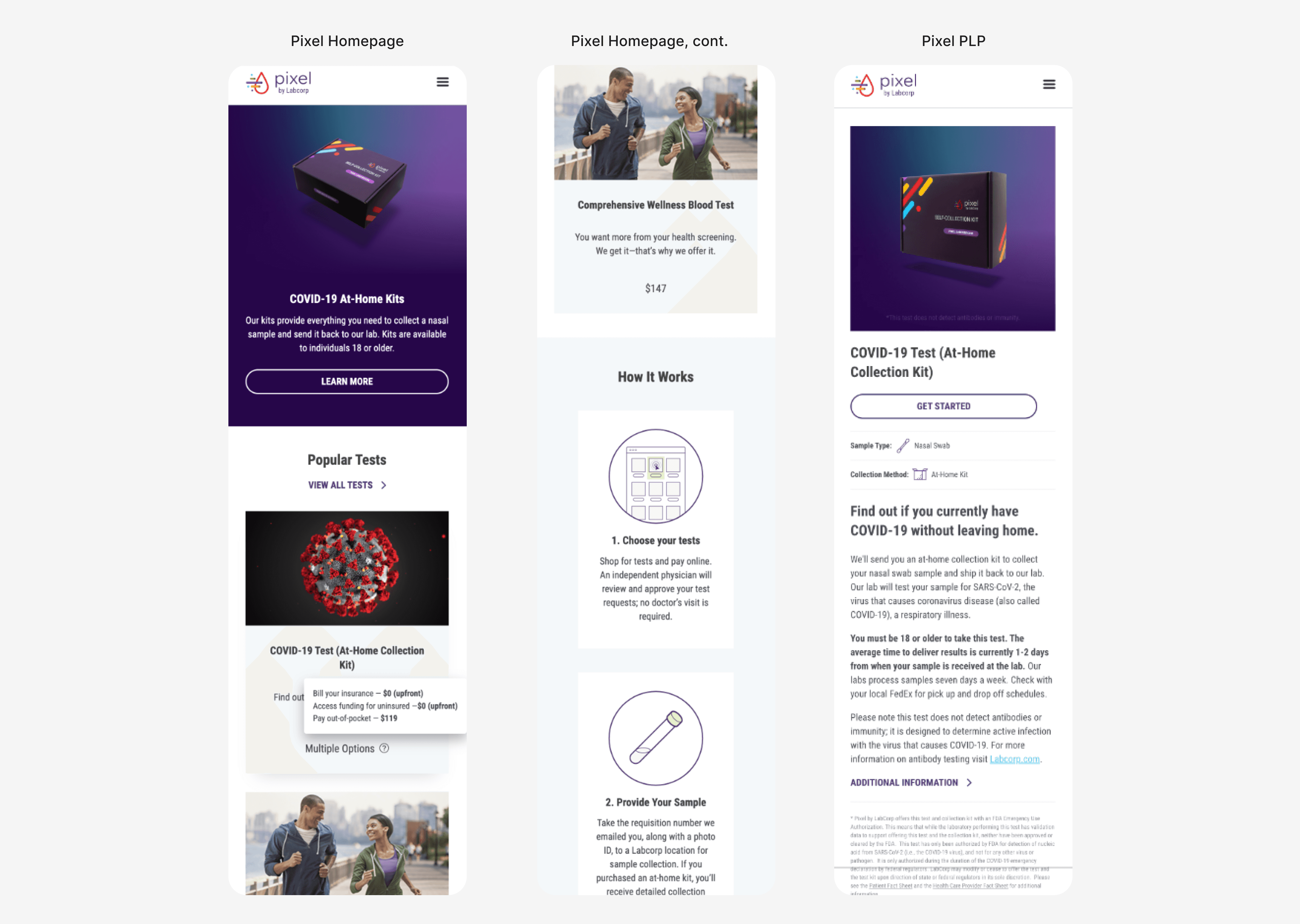
In just a few months, Labcorp had to launch an e-Commerce website for consumers to access self-ordered, at-home testing. The existing site (branded Pixel) struggled with:
Misplaced CTAs and content overload
Obscure pricing and insurance information
Poor online shopping experience for self-ordered, at-home testing
Changing industry regulation on insurance coverage and other legal requirements
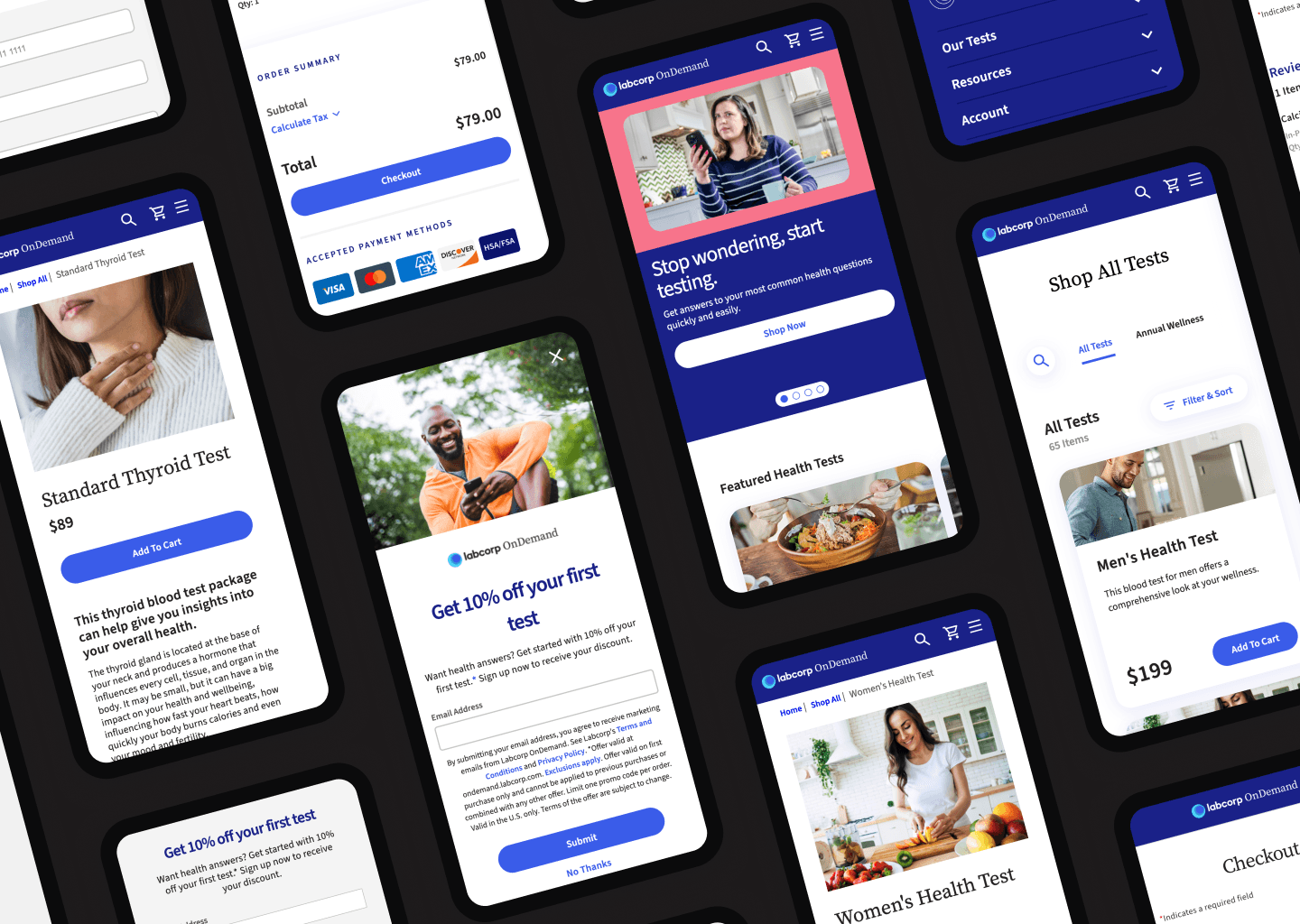
Our goal was to launch an intuitive Labcorp OnDemand platform on Adobe Experience Manager (AEM) CMS with a brand new design system, optimizing the user experience and conversion rates in an entirely new industry.
As Senior Experience Designer for the MVP and later UX Lead for additional feature launches, I collaborated with a cross-functional team and conducted over 40 usability tests to inform feature development. Key responsibilities included:
Usability testing (heuristic evaluations, card sorting, prototype testing)
Wireframing and designing templates for key pages
Ensuring WCAG accessibility compliance and QA
Requirements gathering and stakeholder presentations
Working in an Agile environment
Working with UI designers to build a comprehensive Figma component design system with dev-ready specs
Card Sorting for Test Categories
To understand how users categorize different health tests, we conducted a card sorting exercise. This helped us organize our product listing page (PLP) effectively. Key findings:
Users struggled with medical jargon, with one-third finding it unclear or difficult to sort three of the tests
4 out of 21 participants wanted to place items in multiple categories, indicating a need for cross-referencing
Global Navigation Testing
We tested various global navigation designs to ensure users could easily find what they needed. Key findings:
33% of users tried clicking on the Profile icon in the header when given the task to register kit or view test results
Users preferred having navigation items with similar actions/intent grouped together
The "Shop Tests" highlight gave users a clear target for finding tests in the navigation
Product Detail Page (PDP) Iterations
We went through multiple rounds of usability testing for the PDP, focusing on content organization and user comprehension. Key findings:
80% of users preferred a long-scroll page where all content was displayed instead of collapsed sections
53% of users preferred product chemistry details in accordions for easier access
60% of users preferred a modal drawer for "What's Tested" information rather than linking to individual test pages
For our initial MVP, in addition to the design of several critical components and page templates, we delivered:
Optimized global navigation and intuitive search functionality
Streamlined templates for product detail and landing pages
Redesigned cart and checkout experience for higher conversion rates
Revamped homepage to boost engagement and clearly communicate value proposition
For later enhancements we added:
Improved site navigability with a sticky search bar
Added ratings and reviews functionality to increase credibility and boost conversion
Adding digital payments functionality (Apple Wallet, Google Pay, PayPal) for ease of use
Explorations of a site "mini cart", ultimately choosing not to move forward
At the risk of sounding lofty: user-centered design is crucial, even in highly regulated industries.
The work never ends; continuous testing and iteration are key to improving complex user flows, especially in a new business model.
With more time and resources, I would have loved to implement A/B testing on the live website to validate our work and continue bringing in features from the backlog.
By focusing on user needs and leveraging data-driven design decisions, we successfully transformed Labcorp's digital presence, making healthcare more accessible to thousands of users.
