Streamlining USAA's Credit Card Application

Client
USAA
Year
2023-2024
Role
Senior Experience Designer
Project Type
UX Research
UX Design
Web App
For confidentiality, I have omitted and obfuscated certain information in this case study. All information here is my own and does not necessarily reflect the views of the named client.

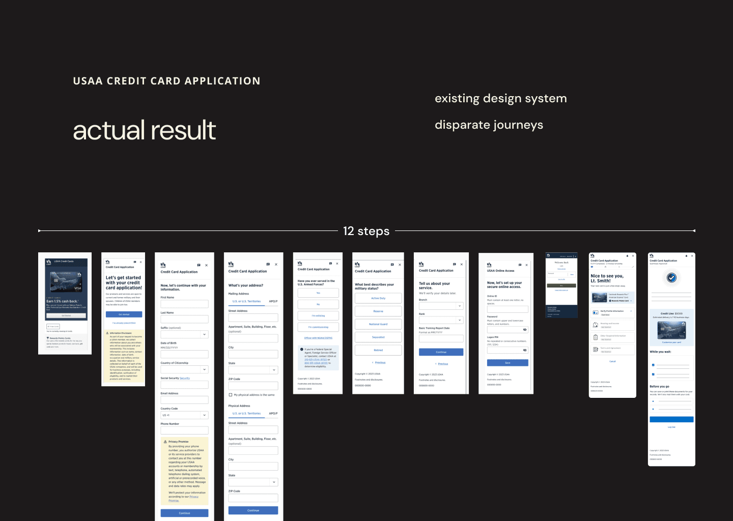
As Senior Experience Designer and Researcher, I was part of an effort to redesign USAA's credit card application process. The existing flow was cumbersome, with dozens of steps and a low conversion rate from application start to submit. The backend involved 5-6 siloed teams, resulting in a disjointed user experience with several distinct visual identities.
For this project, I applied a wide range of skills including user mapping, stakeholder interviews, competitive research, prototyping, and moderated user interviews.
Our goals included:
Streamline a 24-step application process
Unify three separate visual identities
Improve the 1.2% conversion rate
Simplify backend processes involving multiple siloed teams
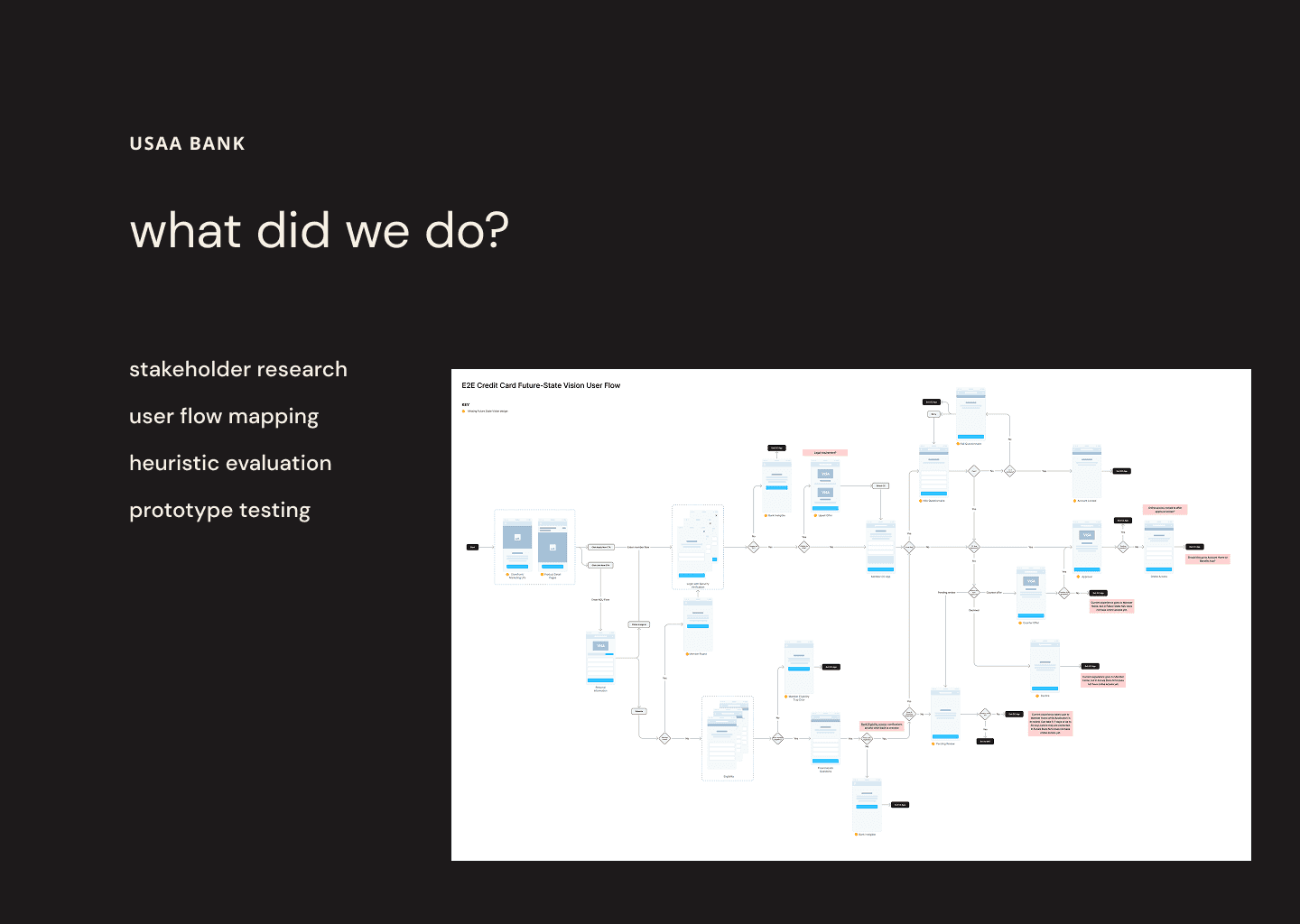
Stakeholder Understanding
Conducted all-day, in-person workshop with stakeholders to understand business requirements and backend processes
Created user maps to visualize the current application journey and validate with stakeholders
Conducted moderated user interviews to gather insights on pain points and expectations
Usability Testing Insights
As part of the research process, I was instrumental in creating test prototypes, conducting interviews, and capturing key insights. Our usability testing revealed:
85% of testers preferred the new streamlined flow over the existing one
The new design was perceived as faster to complete, taking about 1.5 minutes less than the existing flow
Users appreciated the simple design, clear guidance, and alignment with expectations to start with personal information
In the existing flow, most testers struggled with the first log-in page, with only 4 out of 52 testers going straight to the "Join" button
25% of testers dropped out before completing the entire application in the existing flow
Users found the existing flow long, outdated, and confusing, describing it as "cumbersome" and "never-ending"
In addition to our heuristic evaluation and competitive research, the above methods provided insights that strongly supported our decision to simplify the application process and unify the visual identity, validating the potential impact of reducing steps from 24 to 7.
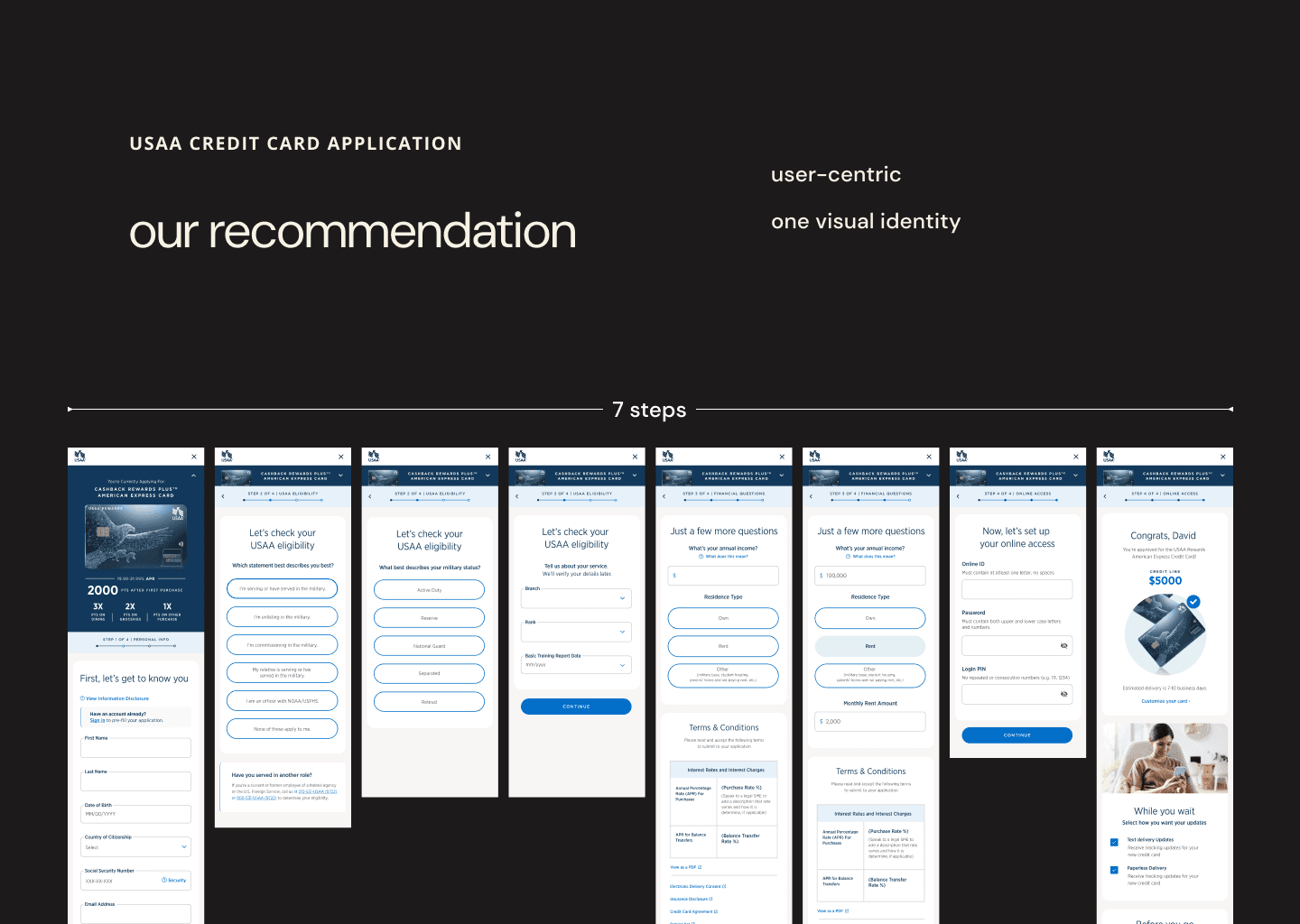
The final design proposal reduced the application steps greatly and featured a single, cohesive visual identity. While resource constraints prevented implementation, the project laid groundwork for future improvements.
Audience targeting is key in gathering relevant insights; we discovered that the military audience was more accepting of the status quo than the control (non-military) group.
Although the designs were not implemented due to resource limitations, this project provided valuable insights into the challenges of redesigning complex financial processes and highlighted the importance of simply gathering stakeholders in a room to talk to each other.